Contact - Branding design for next-gen social network

About the project
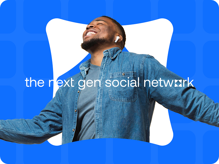
Meet Contact - the social network for families, friends and companies seeking closer connections worldwide. Thoughtfully designed for those limited in physical presence but wanting to feel near loved ones.
The overall image is rich, contrasting, and diverse, like three-flavored chewing gum from the movie Charlie and the Chocolate Factory, which is achieved through the rounded shape of the logo and the dynamic color palette.
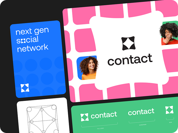
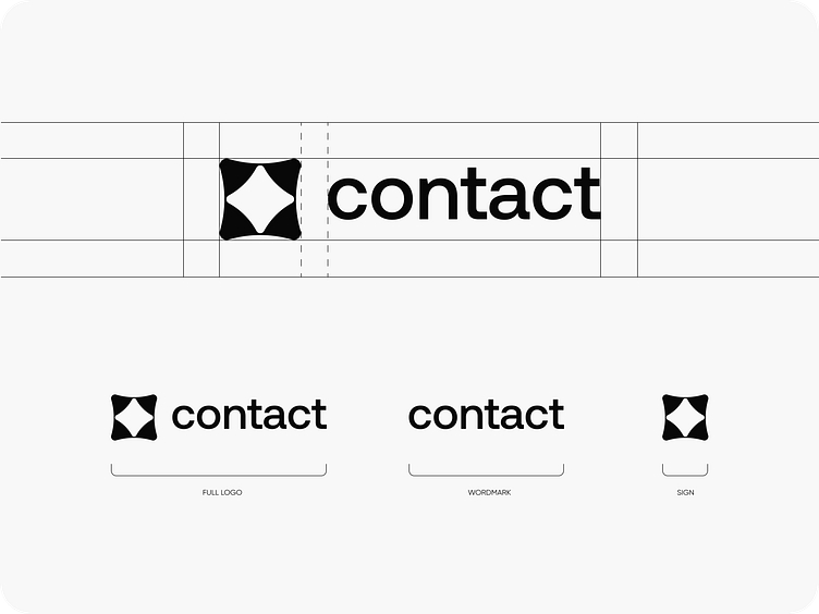
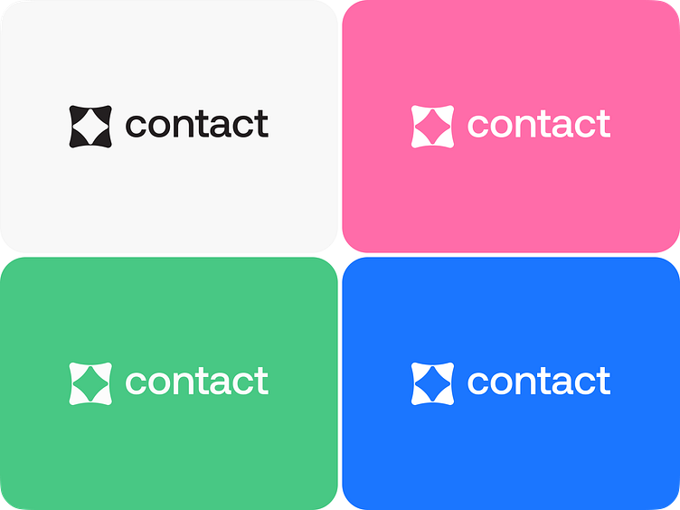
Logo design
The logo is made in the form of a combination of two elements, which symbolize contact, and the edges of the elements themselves symbolize the participants in this communication.
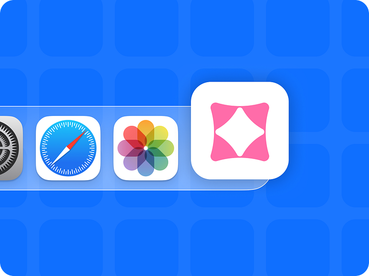
The logo also acts as a separate branding element that can be transformed into different forms, take on different colors and change the place of application, which is evident in marketing materials.
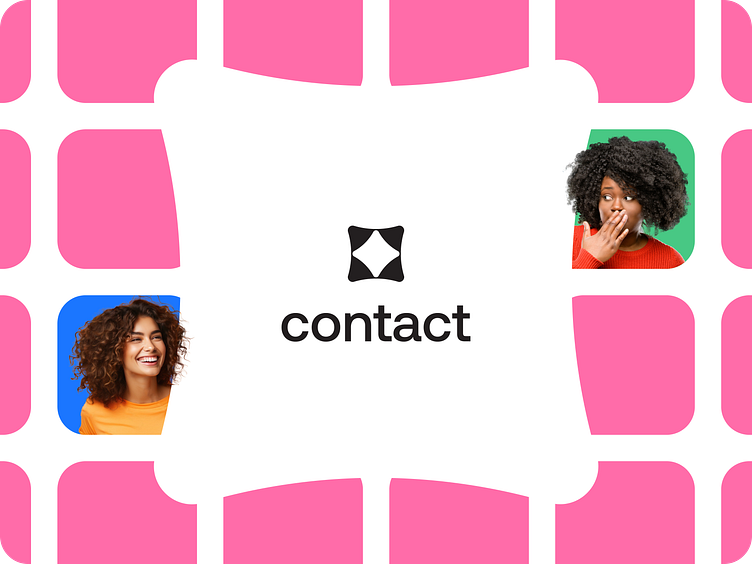
Brand image
To reinforce the friendly image, we use joyful, rich, and emotional photos of people using the product's service.
As a result, we got a cheerful, dynamic and eclectic product that will make a mark in the memory of users and give them the joy of new contacts.