Mooi - Branding for a task management platform

Brand's consistency
Crafting a powerful brand identity is akin to forging a lasting connection with your audience. It's one of the crucial cornerstones of trust and recognition.
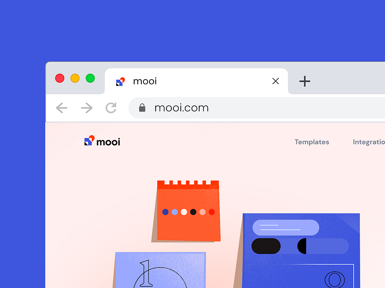
We already talked about Mooi's logo design which is the fusion of simplicity and functionality. Now it is time to reveal the full branding of this project.

Color palette
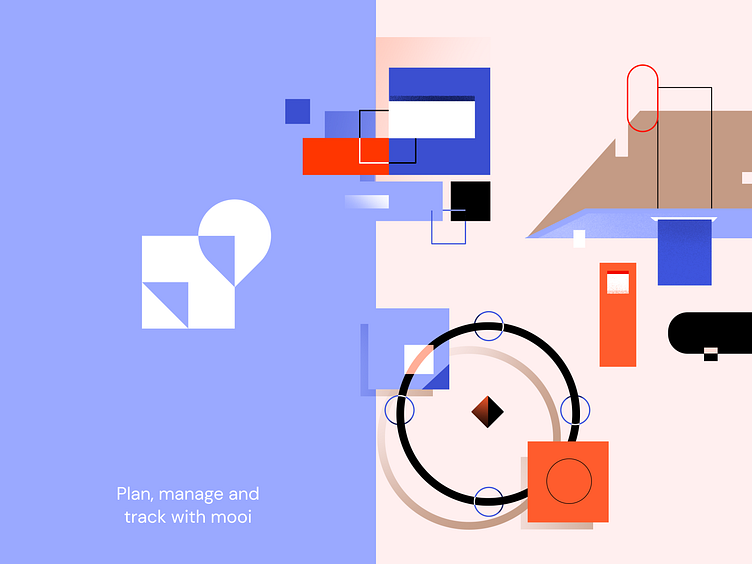
The interplay of bright and pastel colors in blue and red is more than a color scheme.
It's a narrative of confidence, security, and tranquility intertwined with the pulsating rhythms of energy and activity - the very heartbeat of productive work.
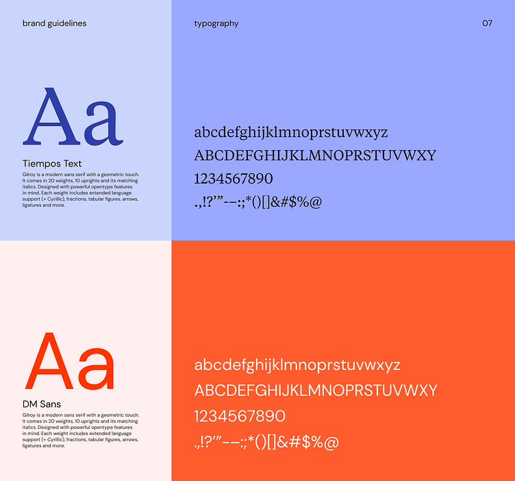
Typography
Typography takes center stage with a captivating play of contrasts.
Elegant serifs demand attention in headlines, while a graceful sans-serif guides through the text, creating balance.

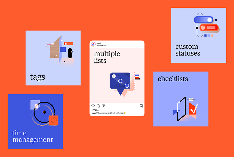
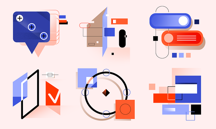
The Illustrations
The visual language of Mooi speaks volumes. Vibrant, contrasting illustrations breathe life into the brand, mirroring its ethos of openness, dynamism, and boundless energy.