Session Logo Design (Updated)

About Session
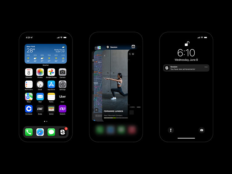
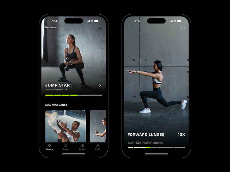
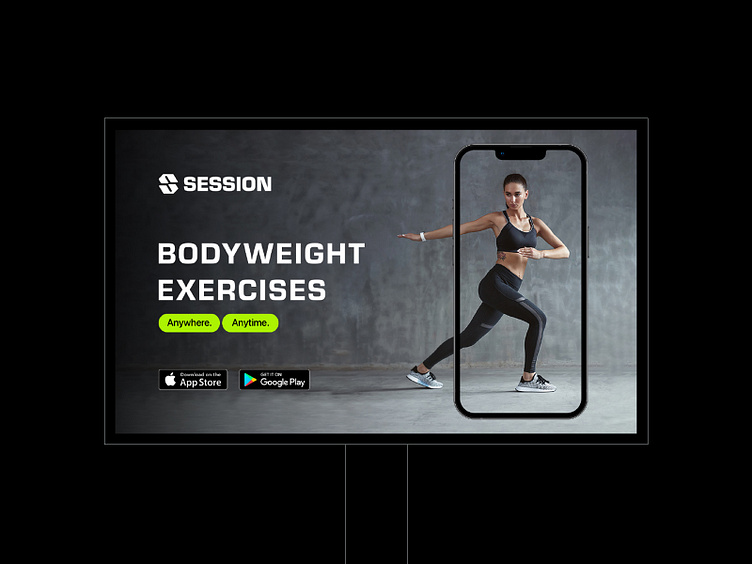
Session is an upcoming fitness app that will revolutionize how people exercise. The goal is to make your workouts more productive and effective with 20-30 minute sessions. All exercises are designed using bodyweight and basic equipment only. The app uses an AI system to create workout plans designed specifically for you, based on your feedback.
The Challenge
Since the project is about a fitness app revolutionizing how people exercise, the mission was to create a brand identity system bold enough to represent this innovative idea. Session needed a strong and confident voice, from the color palette to typography, working along with an impactful logo-mark – the result is a cohesive brand identity system.

My Approach
Session is a great name – short and strong. Working on a logotype could be an option, but since it's a mobile app, my focus was on how it would look on screens. It should also work as an icon, especially as an app icon. The direction I decided to follow was a lettermark, featuring a unique S design. After an extensive exploration phase and experimenting with different applications, the final design was an S lettermark that represents all the brand attributes: bold, minimal, movement, innovative and confidence.