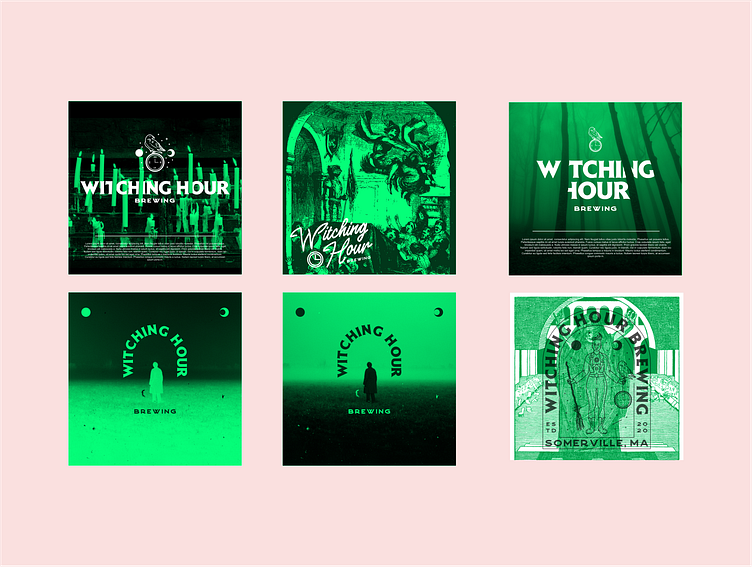
Brand Identity: Witching Hour Brewing

Witching Hour Brewing is a small brewery in Somerville, MA
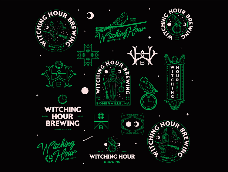
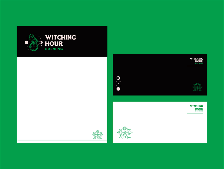
The client wanted a flexible brand identity that would stand out on the shelf.
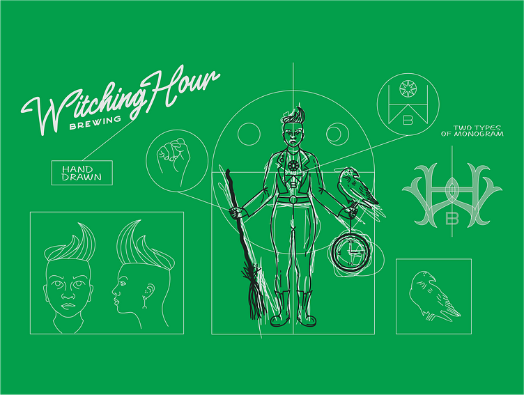
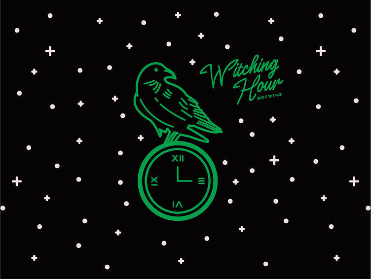
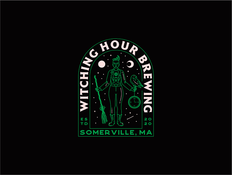
We achieved it with an esoteric approach, celestial green hue
and playful “witchy” details – ravens, moons & clocks.
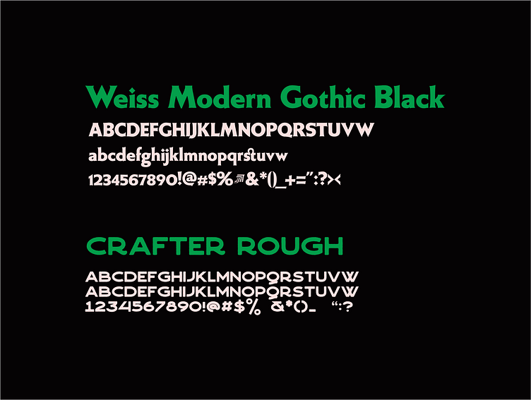
The main typeface is a serif originally designed in 1926 in Germany.
Weiss Modern Gothic is its first digital re-creation with a lot of
improvements of a late 70s well-known edited typeface by Bauer.
Crafter is a handmade sans-serif font from 1871 Project.
It takes inspiration from vintage metal signs & sign painters.
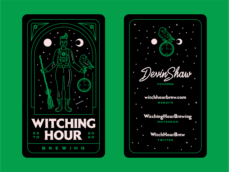
As for the Stationery, we wanted to make it as unique as the logo itself.
That's why we opted for a vertical business card, and handwritten type.
The project was awarded in 2021 by 99designs
in the category of Best Branding Design.
“Coric Design’s approach makes this brewery instantly recognizable.
We love how each illustrative element gets a moment to shine.
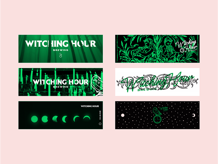
The ravens, moons, and clocks (set to 3am, of course) can be
constantly rearranged to make each part of the brand special,
from business cards to beer cans.” - 99designs
“I believe the strongest branding work has been portrayed by Coric Design
with Witching Hour. The reason for my decision is that it’s a very flexible
and unique brand identity. I think the variety of graphics and logo lockups is promising a versatile use in different media. I can see these design elements
being used by themselves and also in combination, which is a sign of a solid,
self-representative and unique branding concept. The color palette is well
balanced and representative of the brand message. The custom graphics show
a great skillset of the designer and are all designed in a cohesive style. All in all
this brand is very unique and has a strong character, which is important in today’s world of product presence.” - Julia Masalska, branding designer & educator